Box Map
What is the map equalent to a box plot? Lets remind oursevles of what a box plot is.
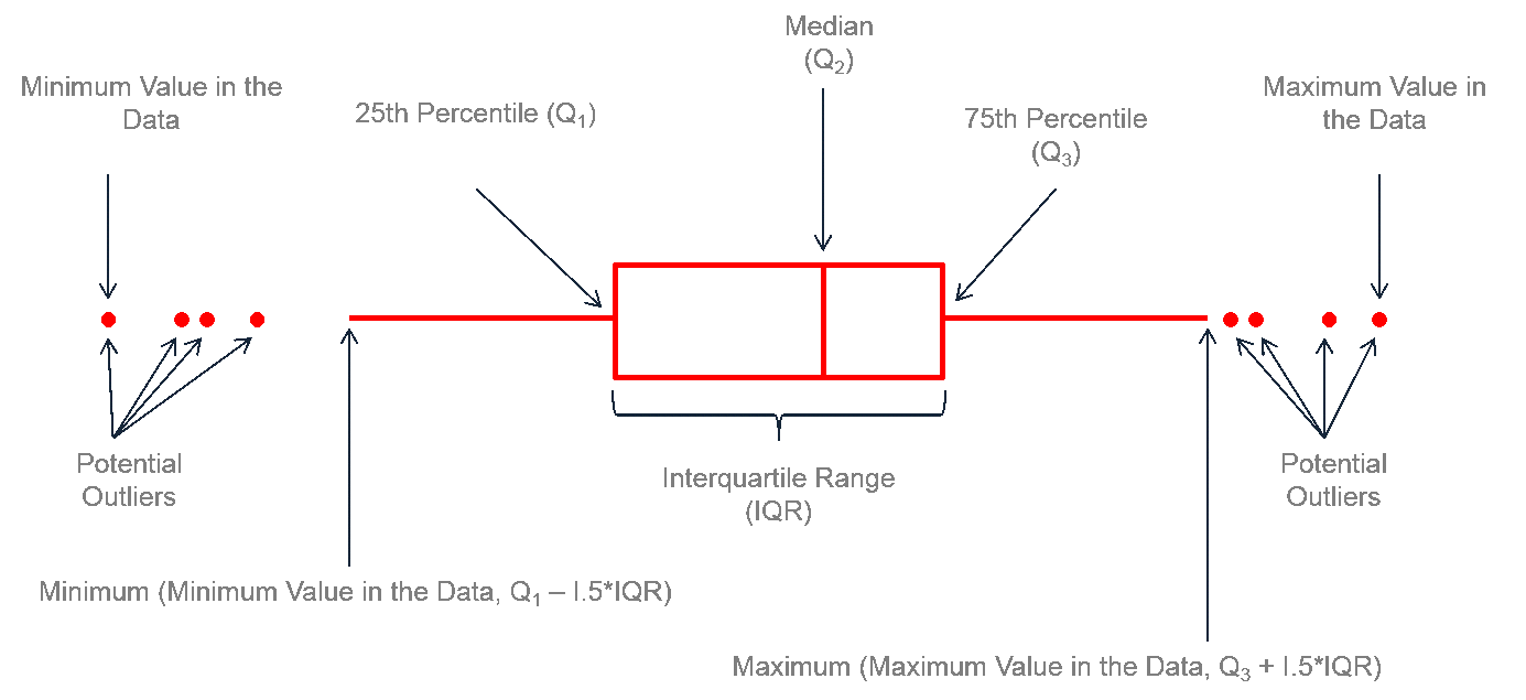
A box map (Anselin 1994) is the mapping counterpart of the idea behind a box plot. The point of departure is again a quantile map, more specifically, a quartile map. But the four categories are extended to six bins, to separately identify the lower and upper outliers. The definition of outliers is a function of a multiple of the inter-quartile range (IQR), the difference between the values for the 75 and 25 percentile. As we will see in a later chapter in our discussion of the box plot, we use two options for these cut-off values, or hinges, 1.5 and 3.0. The box map uses the same convention.
Standard deviation map
The third type of extreme values map is a standard deviation map. In some way, this is a parametric counterpart to the box map, in that the standard deviation is used as the criterion to identify outliers, instead of the inter-quartile range.
In a standard deviation map, the variable under consideration is transformed to standard deviational units (with mean 0 and standard deviation 1). This is equivalent to the z-standardization we have seen before.
The number of categories in the classification depends on the range of values, i.e., how many standard deviational units cover the range from lowest to highest. It is also quite common that some categories do not contain any observations.
Quantile map
A quantile map is based on sorted values for a variable that are then grouped into bins that each have the same number of observations, the so-called quantiles. The number of bins corresponds to the particular quantile, e.g., five bins for a quintile map, or four bins for a quartile map, two of the most commonly used categories.
Problems of Quantile map
Any time there are ties in the ranking of observations that align with the values for the breakpoints, the classification in a quantile map will be problematic and result in categories with an unequal number of observations.
Natural breaks map
A natural breaks map uses a nonlinear algorithm to group observations such that the within-group homogeneity is maximized, following the pathbreaking work of Fisher (1958) and Jenks (1977). In essence, this is a clustering algorithm in one dimension to determine the break points that yield groups with the largest internal similarity.
In comparison to the quartile map, the natural breaks criterion is better at grouping the extreme observations. The three observations with zero values make up the first category, whereas the five high rent areas in Manhattan make up the top category. Note also that in contrast to the quantile maps, the number of observations in each category can be highly unequal.
Equal intervals map
An equal intervals map uses the same principle as a histogram to organize the observations into categories that divide the range of the variable into equal interval bins. This contrasts with the quantile map, where the number of observations in each bin is equal, but the range for each bin is not. For the equal interval classification, the value range between the lower and upper bound in each bin is constant across bins, but the number of observations in each bin is typically not equal.
Choropleth Map for Rates
Spatially extensive and spatially intensive variables
We start our discussion of rate maps by illustrating something we should not be doing. This pertains to the important difference between a spatially extensive and a spatially intensive variable. In many applications that use public health data, we typically have access to a count of events, such as the number of cancer cases (a spatially extensive variable), as well as to the relevant population at risk, which allows for the calculation of a rate (a spatially intensive variable).
A major problem with spatially extensive variables like total counts, in that they tend to vary with the size (population) of the areal units. So, everything else being the same, we would expect to have more lung cancer cases in counties with larger populations.
Instead, we opt for a spatially intensive variable, such as the ratio of the number of cases over the population. More formally, if O_i is the number of cancer cases in area i, and P_i is the corresponding population at risk (in our example, the total number of white females), then the raw or crude rate or proportion follows as:
r_i = O_i/P_i
Variance instability
The crude rate is an estimator for the unknown underlying risk. In our example, that would be the risk of a white woman to be exposed to lung cancer. The crude rate is an unbiased estimator for the risk, which is a desirable property. However, its variance has an undesirable property, namely
Var[ri]=πi(1−πi)/Pi,
where πi is the underlying risk in area i.4 This implies that the larger the population of an area (Pi in the denominator), the smaller the variance for the estimator, or, in other words, the greater the precision.
The flip side of this result is that for areas with sparse populations (small Pi), the estimate for the risk will be imprecise (large variance).
Moreover, since the population typically varies across the areas under consideration, the precision of each rate will vary as well. This variance instability needs to somehow be reflected in the map, or corrected for, to avoid a spurious representation of the spatial distribution of the underlying risk. This is the main motivation for smoothing rates, to which we return below.
Empirical Bayes (EB) Smoothed Rate Map
Borrowing strength
As mentioned in the introduction, rates have an intrinsic variance instability, which may lead to the identification of spurious outliers. In order to correct for this, we can use smoothing approaches (also called shrinkage estimators), which improve on the precision of the crude rate by borrowing strength from the other observations. This idea goes back to the fundamental contributions of James and Stein (the so-called James-Stein paradox), who showed that in some instances biased estimators may have better precision in a mean squared error sense.
GeoDa includes three methods to smooth the rates: an Empirical Bayes approach, a spatial averaging approach, and a combination between the two. We will consider the spatial approaches after we discuss distance-based spatial weights. Here, we focus on the Empirical Bayes (EB) method. First, we provide some formal background on the principles behind smoothing and shrinkage estimators.
Bayes Law
The formal logic behind the idea of smoothing is situated in a Bayesian framework, in which the distribution of a random variable is updated after observing data. The principle behind this is the so-called Bayes Law, which follows from the decomposition of a joint probability (or density) into two conditional probabilities:
P[AB]=P[A|B]×P[B]=P[B|A]×P[A]
where A and B are random events, and | stands for the conditional probability of one event, given a value for the other. The second equality yields the formal expression of Bayes law as:
P[A|B]=P[B|A]×P[A]/P[B]
In most instances in practice, the denominator in this expression can be ignored, and the equality sign is replaced by a proportionality sign:
P[A|B]∝P[B|A]×P[A]
In the context of estimation and inference, the A typically stands for a parameter (or a set of parameters) and B stands for the data. The general strategy is to update what we know about the parameter A a priori (reflected in the prior distribution P[A]), after observing the data B, to yield a posterior distribution, P[A|B]. The link between the prior and posterior distribution is established through the likelihood, P[B|A]. Using a more conventional notation with say π as the parameter and y as the observations, this gives:
P[π|y]∝P[y|π]×P[π]
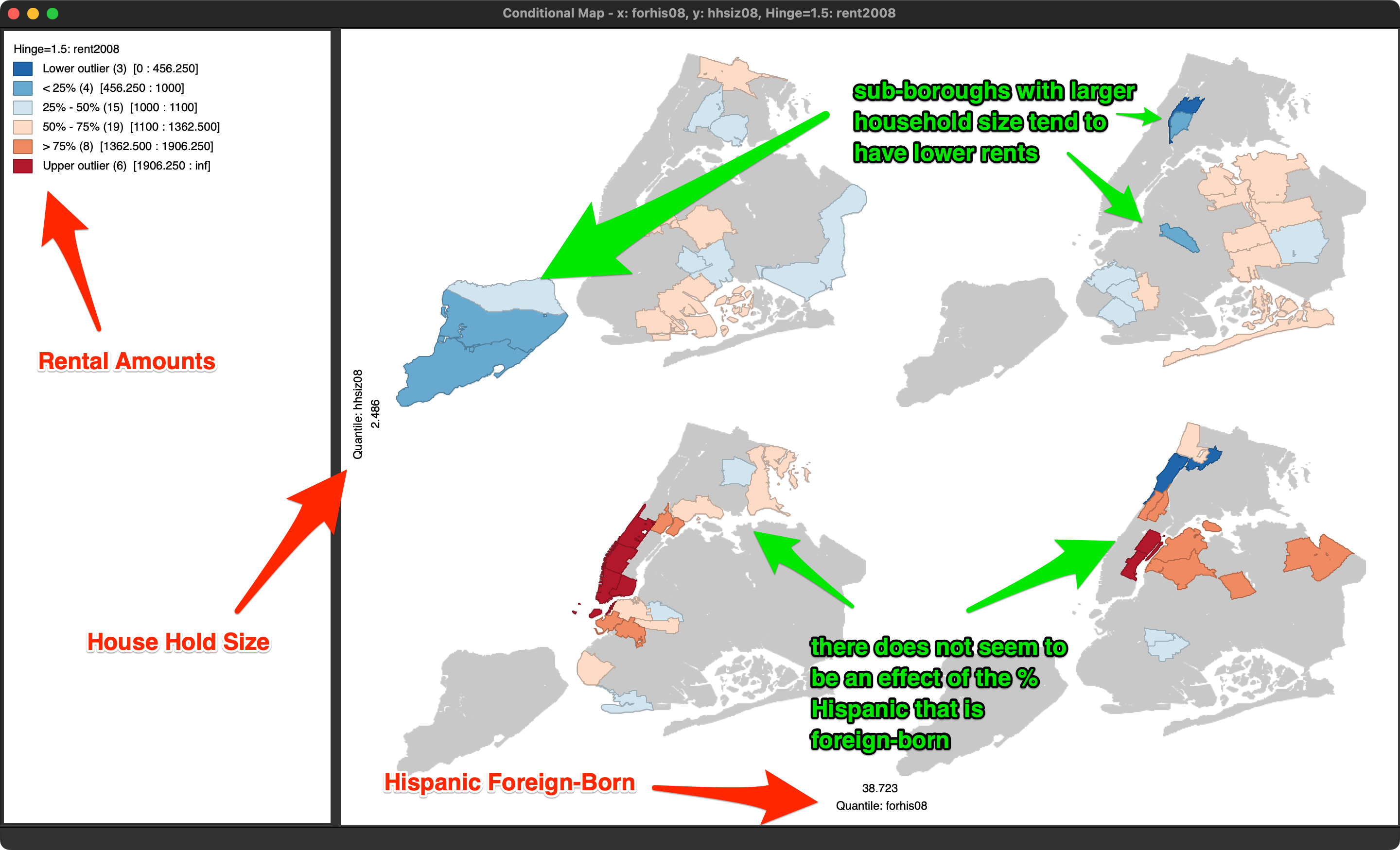
Conditional Map
We consider conditional plots more in depth in the treatment of EDA, but one option is to use a map. This is also known as a conditioned choropleth map, or a micromap matrix, discussed at length in Carr and Pickle (2010). A micromap matrix is a matrix of maps that each pertain to a subset of the observations, determined by the conditioning variables on the horizontal and vertical axes. Each map shows the spatial distribution of the variable of interest, but only for those observations that fall into the associated categories of the conditioning variables.
The main objective behind this conditioning is to detect any potential interaction between the conditioning variables and the topic of interest. The point of departure (or, null hypothesis) is that there is no interaction. If this were indeed the case, then the patterns shown on all the micromaps should be essentially the same. If there is interaction, then we would see high or low values of the variable of interest systematically associated with specific categories of the conditioning variables.
Selecting this option brings up a variable selection dialog containing three columns, as was the case for the conditional histogram plots. The first column pertains to the conditioning variable for the horizontal axis, the second defines the conditioning variable for the vertical axis. The third column, Map Theme, selects the variable that will be mapped.
In our example, in Figure 53, we use forhis08 (% of Hispanic population not born in the U.S.) and hhsiz08 (average number of people per household) as the two conditioning variables, and rent2008 (median rent) as the focus variable. All values are for 2008. Note that the second column also contains an empty category, which can be used when only conditioning on one dimension.